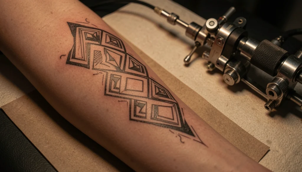
I have been obsessed with geometric arm wrap tattoo designs for months now – they feel like wearable jewelry that also tells a story. I keep scrolling through saved pins, swiping ideas into a folder titled “someday” and daydreaming about which shapes would hug my forearm best.
This little guide exists because I wanted to put together the best arm wrap visuals in one place, plus share what actually worked when I sketched and then sat in the chair. I’ve tried a few line-based pieces and learned tiny things about placement, contrast, and how your skin affects the crispness of sharp geometry.
Below you’ll find 23 curated pins with quick, no-fluff thoughts from me – styling notes, placement tips, and a couple of honest confessions about my own tattoo journey. Save your favorites and get ready to mix and match ideas.
These 23 Geometric Arm Wrap Tattoo Designs Will Make You Want to Book an Appointment
Simple Line Wrap
This image feels like the perfect intro to arm wraps – clean, confident lines that curve with the arm. I once sketched something similar and realized that negative space can be as loud as ink, so don’t overfill. If you’re testing geometric arm wrap tattoo designs, start small and see how the wrap reads when your arm moves.
Monochrome Contrast Band
Bold black-and-white geometry always catches my eye; this one reads very architectural. You could make it softer by adding dotwork or a thin gap between sections. I promise it’s worth asking your artist how the contrast will age on your skin.
Zipper Wrist Accent
This quirky zipper detail around the wrist is such a fun way to end a wrap – unexpected and playful. I once showed this to a friend who joked it looked like wearable hardware, which made me love it more. Try combining an industrial element like this with softer geometric fills if you want a balance.
Forearm Architectural Lines
The way the lines follow muscle and bone here is so flattering – this is a great example of mapping geometry to anatomy. I learned the hard way that placement matters more than size, so I always test-wrap with a marker first. Your artist can stencil and tweak until it feels like it belongs to your arm.
Minimal Single-Band
A single precise band can read luxe and minimal at once, which is why I keep coming back to this idea. If you want geometric arm wrap tattoo designs that don’t shout, a thin band with perfect symmetry is a safe bet. Also, thinner lines may blur over the years so ask about needle sizes.
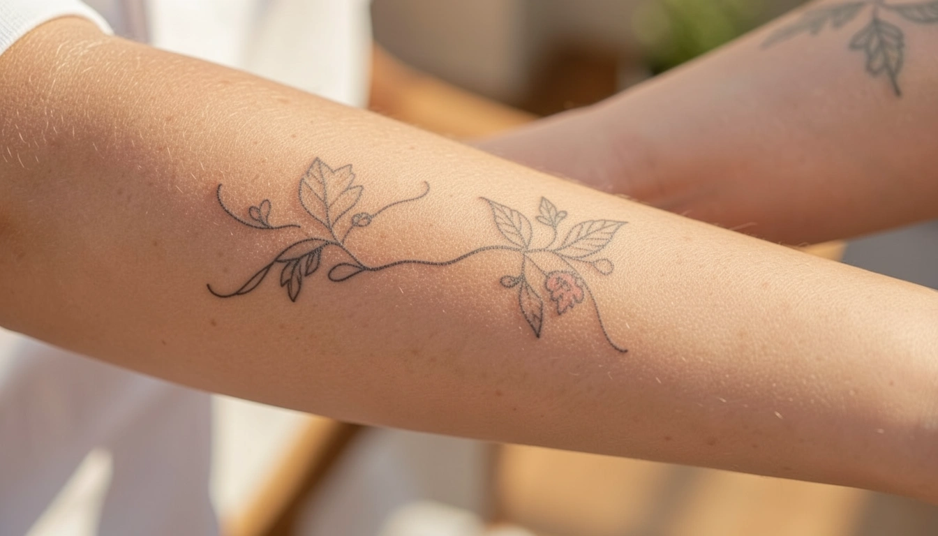
Botanical Geometry Mix
I love how the plant pairs with rigid shapes here – it softens the whole wrap. When I designed my first half-wrap, I mixed florals with geometry and people kept asking if it was a sleeve. Consider alternating organic motifs with crisp triangles to keep the composition approachable.
Sun-Centered Wrap
This one centers a sun in the middle of the wrap and radiates geometry outward – a killer focal point. You could swap the sun for any circular symbol that means something to you. I found that choosing a focal motif first makes designing the rest of the wrap so much easier.
Leatherbag Backdrop Shot
The accessory in the background gives this photo a lifestyle vibe, which is helpful when imagining the tattoo in real life. You might try photographing your own arm against different fabrics to see how contrast works. That quick test helped me decide whether my lines needed to be thicker.
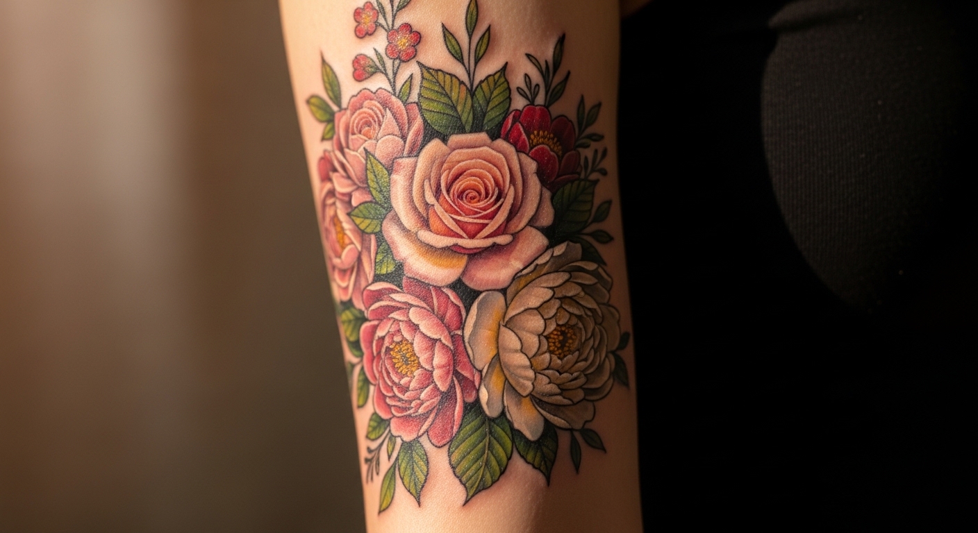
Floral Accent Band
Flower tattoos woven into geometric bands look delicate but still structured – a lovely compromise. My sister opted for this kind of combo and she says it still feels chic years later. If you want both softness and order, try a repeating floral motif inside a geometric band.
High-Contrast Male Wrap
Strong black fills and negative triangles make this a very masculine-feeling wrap, though anyone can pull it off. You should think about how dense you want your fill areas, because heavy black ages differently than linework. I watched an artist blend solid black with fine lines once and it looked incredible.
Thin Line Repetition
Repeated thin lines create a texture that reads like fabric when viewed from a distance. You can layer this approach with tiny dotwork to add depth. When I tried this pattern on paper it felt hypnotic – in a good way.
Orange Accent Band
The pop of orange ring here is unexpected and lively – color can totally change a wrap’s vibe. If you’re curious about color, ask your artist about pigment choices that match your undertone. I wasn’t sure about color at first, but a small accent convinced me.
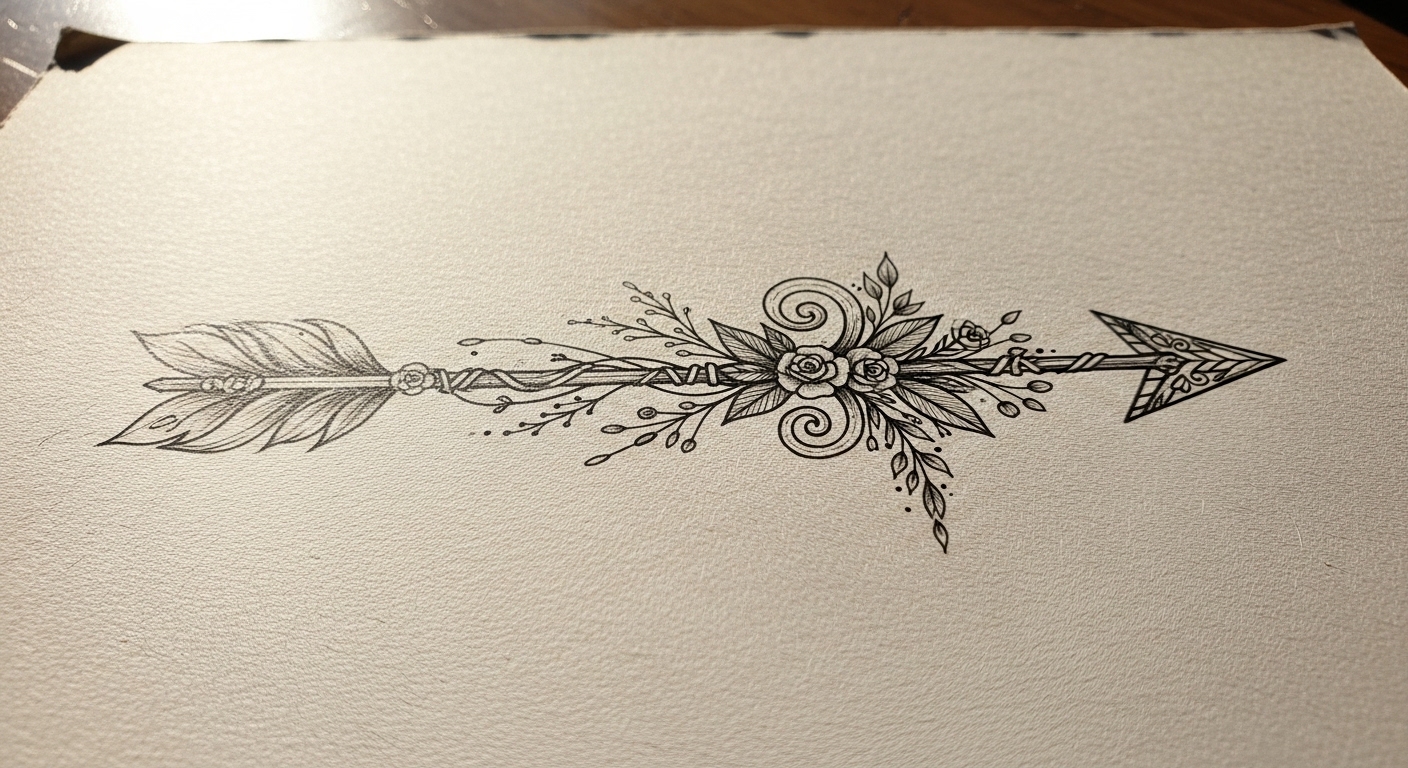
Directional Arrow Wrap
An arrow integrated into a wrap reads both symbolic and dynamic – like movement frozen in ink. You might place the arrow to point toward something meaningful on your body. I once got an arrow pointing toward my heartbeat and it felt like a tiny ritual.
Line-Drawing Arm Sketch
This black-and-white sketchy vibe makes the whole wrap feel hand-drawn, which is charming. If you like that imperfect look, tell your artist you want a looser finish instead of perfect geometry. There’s a sweet note to art that feels human and not overly clinical.
Intricate Blackwork
Look at the detailed interplay of shapes here – it’s almost lace-like. This is great if you want a statement wrap that still reads refined. I asked to photograph a piece like this during healing and the texture looked like woven ink.
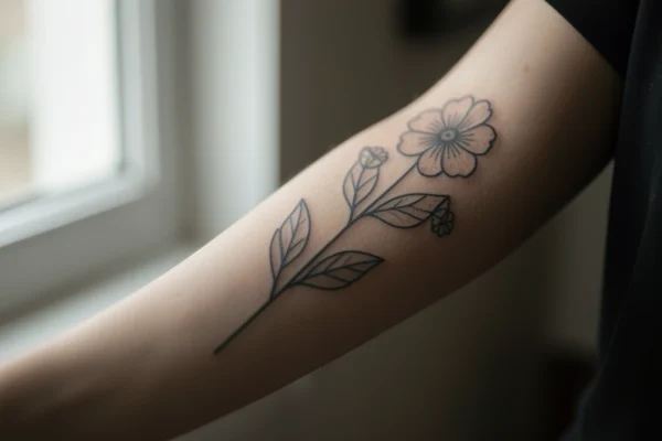
Simple Flower Band
A single row of tiny floral symbols can make a geometric wrap feel softer without losing structure. You could alternate tiny flowers and triangles for rhythm. One friend combined this with a wrist cuff and it looked effortlessly put together.
Twin Floral Panels
Two mirror floral designs create balance and are surprisingly modern when paired with geometry. Try mirroring elements on either side of the arm if you want symmetry. I almost always try symmetry first and then tweak one element to make it personal.
Casual Mirror Selfie
This selfie shows how a wrap looks in everyday light – super useful for imagining real-life wear. You should take a few phone pics of potential placements so you can see the scale. I still have a “try-on” folder on my phone for this exact reason.
Flower of Life Geometry
The Flower of Life pattern in black and white is a classic geometric motif that turns into a stunning wrap. If spiritual symbolism matters to you, this pattern reads thoughtful rather than trendy. I almost went with this for my own wrap – wait, actually I still might.
Sunburst Accent
Small sunburst elements scattered through a band add movement and light. You can scatter tiny motifs like stars or suns within a geometric grid for subtle whimsy. When I sketched suns into a wrap design, strangers complimented it within days.
Thin Rings Combination
Multiple thin rings stacked together create a layered cuff effect that’s both modern and timeless. This approach is easy to scale up or down depending on how visible you want the wrap to be. I recommend starting with two rings and adding more in a second session if you get hooked.
Geometric Blackwork Panel
Solid black panels framed with thin lines make such a striking wrap – bold and graphic. You should think about touch-ups; big black areas sometimes require maintenance. My cousin has something similar and she gets them refreshed every few years to keep edges crisp.
Fine Line Sleeve Starter
This darker, moodier shot shows how a wrap can grow into a sleeve if you decide to expand later. I started with a wrap and gradually added pieces around it, which felt like building a playlist over time. Give yourself permission to evolve the design.
Subtle Single Motif
Okay, technically this repeats an earlier source but it’s a useful note – a single motif repeated makes a cohesive wrap without being overwhelming. You might pick a simple shape you love and iterate it around your arm. If you’re indecisive, that repetition can be a lifesaver.
How to Actually Make This Work For You
First, map it out physically – use washable markers or painters’ tape to trace the wrap on your arm, move your hand and forearm, and see how the lines sit when you bend and reach; this will tell you whether a tight cuff or a slightly looser wrap will flatter your anatomy. Second, consult an artist who specializes in fine-line geometry and show them several of the images below so they can translate flat designs into three-dimensional skin-friendly layouts – ask about needle sizes, spacing, and how lines will age on your skin tone. Third, think in sessions – large or heavy blackwork may need touch-ups, while thin linework benefits from small, deliberate passes; plan placement, focal points, and whether you want room to add later. Finally, care matters – follow aftercare closely for crisp healing and avoid aggressive sun exposure so your geometry stays clean and sharp through the years.
Frequently Asked Questions
Usually 2-4 weeks for the top layer, with color and lines settling over a few months. Be gentle during healing, keep it clean, and avoid soaking or heavy sun so the geometry heals crisp.
Fine lines can soften over years, especially on areas that stretch. Ask your artist about slightly bolder linework and long-term touch-up plans – that usually helps a lot.
Yes, adding color later is common and can completely change the vibe of a wrap. Talk to your artist about pigment choices and how color will interact with existing blackwork.
Test with markers or temporary stencils to see how the design moves with your arm. Consider visibility, how it aligns with joints, and whether you want room to expand into a sleeve later.
Thanks for sticking with me through this long scroll – I hope these 23 looks gave you fresh ideas for geometric arm wrap tattoo designs and helped you picture what might work on your own skin. If you liked any of the pins, save them to your tattoo board or send this to a friend who needs inspiration – I usually text mine five at a time. Let me know if you want help narrowing choices or combining two of these into one custom concept – I’m actually planning my next session and love brainstorming.